Good law firm website design means a fast, clear site that shows a visitor who you help, why to trust you, and how to contact you in under a minute, while staying inside your state’s advertising rules. This guide covers what the site must do, the pages to build, trust and design choices, speed and accessibility, ethics, how to build it, and a launch checklist.
Many guides on this topic come from companies that sell website builds, and Lawzen is one of them. I’ll give you the decision framework, so you can judge any quote or template yourself, ours included.
What must a law firm website do?
A law firm website has one job: turn a worried person who searched on their phone into a call or a form submission. Everything else is secondary.
Take a hypothetical three-lawyer injury firm in Phoenix. A visitor lands from Google after a car accident. In the first few seconds they need to know four things: you handle their kind of case, you work in their area, you look credible, and how to reach you right now. If any of those takes scrolling or guessing, many of them will go back and try the next result.
Here is how that plays out on the page. Imagine the hypothetical Phoenix firm’s homepage opens with a headline that names the city and the case type, a phone number you can tap, and one sentence on how a free consultation works. Below that sit three short blocks: the practice areas, the lawyers, and what happens after you call. A visitor who scrolls no further has still seen everything they need to act.
The test I’d use: show the homepage to someone outside the firm for ten seconds, then take it away. Ask what the firm does, where, and how to reach it. If they hesitate on any of the three, the page has not done its job.

Think of the site as six decisions, and make each one on purpose:
- Pages: which ones exist, and what each answers.
- Trust proof: what shows you are real and competent.
- Compliance: what your state bar allows you to say.
- Speed and access: whether the site works on a slow phone and for every visitor.
- Cost: what you pay to build and to keep running. Our law firm website cost breakdown covers this in detail.
- Build route: DIY, template or agency.
What pages does a law firm website need?
Build a small set of pages that each answer one question, then add more only when you have something real to say. A site with eight strong pages beats one with forty thin ones.
| Page | The question it answers |
|---|---|
| Home | Who do you help, and where? |
| Practice area pages | Can you handle my kind of case? |
| Attorney bios | Who will I be talking to? |
| About the firm | Why this firm? |
| Contact | How do I reach you right now? |
| Blog or resources | Can you explain my situation? |
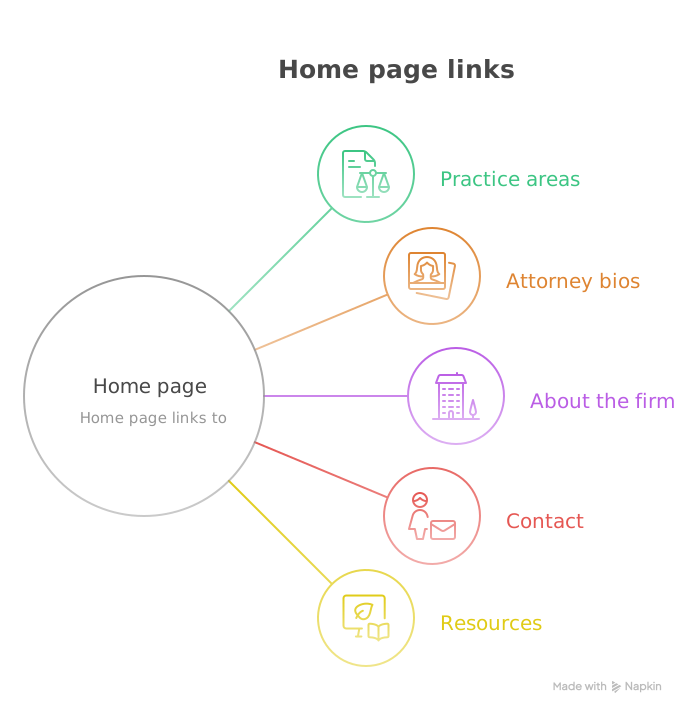
Give each practice area its own page. A page called “Personal injury” is too broad to rank or to reassure. The Phoenix firm is better off with separate pages for car accidents, truck accidents and wrongful death, each written for a person in that situation, with the same contact options on every one.
Put the phone number and a short form in the header and at the end of every page. Do not make visitors hunt for the contact page. Keep forms to name, phone and a short description. Every extra field costs you submissions.
Write each practice page in the order a worried person asks questions. Start with what the case type is and whether you take it. Then cover what happens next, how fees work, how long things usually take, and what to bring to a first call. Avoid statutes and Latin; link to the statute at the bottom if it matters. Every page should end with the same call to action, in the same place, so visitors learn where to look.
Location matters even for a single office. Name the city and county in the page text where it is natural, and give each office its own address block. If you serve several cities, write a real page for each one with local specifics rather than copying the same text and swapping names. Thin duplicate pages help no one.
Add pages only when they earn their place. A resources or blog section helps when it answers questions your clients genuinely ask on the first call. A page of generic news does not. Skip a testimonials page unless your state allows them and you have real ones; put one or two short quotes on the relevant practice pages instead.
Attorney bios deserve real effort because people hire a person, not a firm. Our post on building trust with your law firm website goes deeper on that.
A bio that works has five parts: a clear photo, one plain sentence on who the lawyer helps, bar admissions and years in practice, a short paragraph on the lawyer’s approach in their own voice, and a way to contact that person directly. Leave out the list of every award and the third-person résumé. Visitors read the first three lines and decide whether this is someone they could talk to on the worst week of their year.
Which design choices build trust?
Trust comes from specifics a visitor can check, not from decoration. Real photos of the real lawyers, real office address, bar admissions, and plain-language explanations all do more than a stock-photo gavel.
What works, roughly in order of impact:
- Real people. Professional photos of the attorneys, with names and bar numbers where your state expects them.
- Plain language. Explain “contingency fee” the first time you use it. Write like you talk to a client in your office.
- Proof that is allowed. Reviews from Google, bar association memberships, and publications. Check the ethics section below before showing outcomes or testimonials.
- A visible address and phone number, the same as on your Google Business Profile.
- Clean, quiet design. One typeface family, one accent color, generous spacing.

What I’d skip: autoplay video, pop-ups that cover the page on arrival, sliders that rotate before anyone can read them, and stock photos of handshakes or scales of justice. They add load time and say nothing. Our list of common law firm website mistakes covers more of these, and 5 elements of a successful law firm website design is a shorter version of this section.
How fast and accessible should the site be?
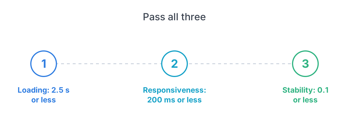
Aim to pass Google’s three Core Web Vitals, its page speed and stability measures, on mobile, and to meet WCAG 2.2 level AA. Both are free to check and both affect real visitors.
Google’s web.dev guide to Core Web Vitals sets these “good” thresholds, measured at the 75th percentile of page loads and separately for mobile and desktop:
| Metric | What it measures | Good |
|---|---|---|
| Largest Contentful Paint | Loading | 2.5 seconds or less |
| Interaction to Next Paint | Responsiveness | 200 ms or less |
| Cumulative Layout Shift | Visual stability | 0.1 or less |
A page passes when it meets all three. You can test your homepage for free in PageSpeed Insights. The usual culprits on law firm sites are oversized photos, background video, chat widgets and too many tracking scripts.
Mobile deserves special attention because many visitors will arrive on a phone. Open your site on a real phone, on cellular data rather than office wifi, and try to call you with one thumb. Check that the tap-to-call link works, the form fields open the right keyboard (numbers for phone), and no text needs pinching to read. Fix those before you touch colors.
If speed testing shows a problem, the order of fixes is usually the same. Compress and resize photos first; a single uncompressed hero image can outweigh the rest of the page. Remove scripts you do not use. Host fonts sensibly and limit yourself to one or two weights. Replace autoplay video with a still image. Then re-test.
Accessibility is separate from speed. The W3C’s Web Content Accessibility Guidelines (WCAG) are the international standard. The current version is WCAG 2.2, organized under four principles: perceivable, operable, understandable and robust (content that works across browsers and assistive tools). Success criteria come in levels A, AA and AAA; level AA is the usual target for a business site.
In practice that means:
- Text contrast strong enough to read in sunlight.
- Every image has descriptive alt text.
- The whole site works with a keyboard alone.
- Forms have visible labels, not just placeholder text.
- Headings follow a logical order.
A note on cost and effort: it is usually easier to build accessibility in than to fix it after launch. Ask any designer or template vendor whether the design meets WCAG 2.2 AA out of the box, and run a free automated checker on your finished homepage. Automated tools catch only part of the problems, so also tab through the site with your keyboard once yourself.
Your visitors include people with vision, hearing, motor or cognitive disabilities, and people who are simply stressed. I am not offering legal advice on accessibility lawsuits; that is a question for your own counsel.
What do ethics rules mean for your website?
Your website is attorney advertising, so advertising rules apply to it, and they differ by state. Rules vary by state; check your state bar before you publish.
Many states base their rules on the ABA’s Model Rules of Professional Conduct, which are published by the American Bar Association. The Model Rules’ sections on communications about a lawyer’s services are the starting point, but your state’s version is the one that binds you. These are the topics where state rules most often differ, so look each one up.
Check these items against your own state’s rules:
- Testimonials and reviews: some states restrict them or require disclaimers.
- Case results: many require a statement that every case is different and past results do not predict yours.
- Words like “best,” “top” and “specialist”: these are limited or prohibited in many states unless you can substantiate them or hold a recognized certification.
- Required disclaimers and the responsible attorney’s name, which some states require on advertising.
- Contact forms: ask your state bar or ethics counsel whether you need a notice that submitting the form does not create an attorney-client relationship, and what to say about confidentiality.
- Where you practice: claiming an office you do not have can be a violation.
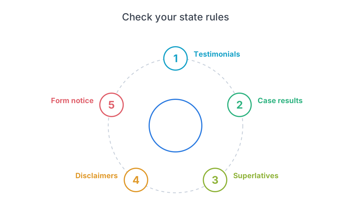
The cheapest fix is a one-time review: read your state’s advertising rule, make a short list, and have whoever edits the site follow it. This is general information, not legal advice.
A practical habit: keep a one-page “advertising rules” note for the firm with the rule numbers, the disclaimers you use, and the date you last checked. When someone adds a new page or a new result next year, they follow the note instead of starting from scratch. Rules change, so put a yearly reminder on the calendar to recheck.
Should you build it yourself, use a template or hire an agency?
Choose the route by how much the site has to win you, not by what looks cheapest. A referral-only firm needs credibility; a firm that wants new clients from search needs a lot more.
| Route | Best for | Main catch |
|---|---|---|
| DIY builder | Referral-based solos | Your time; basic SEO |
| Template or theme | Tight budgets with some help | Looks generic |
| Agency or custom | Firms competing in search | Cost; lock-in |
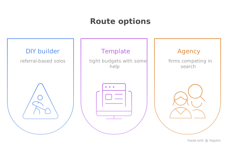
DIY works if you have a few evenings and you mainly need a credible online card. A template gives a faster, more polished start, but you will still need to write every page yourself. An agency makes sense when new-client search traffic is the goal and you want specialists doing the work, though no agency can promise rankings or cases.
Whichever you pick, ask four questions before signing:
- Who owns the domain, content and design if we part ways?
- Can I edit pages myself without paying hourly?
- Is hosting included, and what does it cost after year one?
- What is the page speed on a mobile phone for a site you have already built?
For price ranges by route, see our law firm website cost guide. If you want help with the build itself, our law firm website design service is one option; compare it with others using the questions above.
What is the launch checklist?
Before you go live, check these items in order; most of the expensive mistakes happen in the first two.
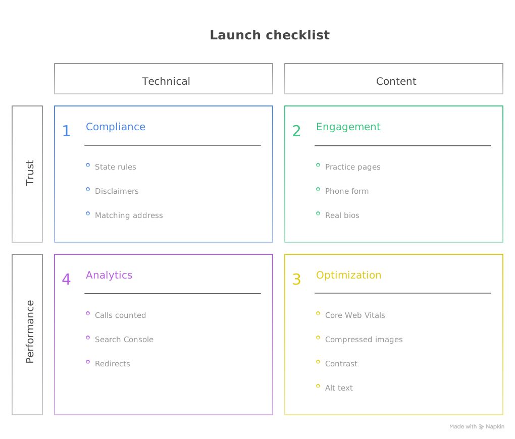
Content
- Each practice area has its own page, written for a person in that situation.
- Phone number and form appear on every page.
- Attorney bios have real photos and bar admissions.
Trust and compliance
- Advertising rules in your state reviewed; disclaimers added.
- Testimonials and results shown only where allowed.
- Address, phone and name match your Google Business Profile exactly.
Speed and access
- Mobile homepage passes the three Core Web Vitals in PageSpeed Insights.
- Images compressed; no autoplay video.
- Contrast, alt text, keyboard use and form labels checked.
Tracking
- Phone calls and form submissions are counted.
- Site submitted to Google Search Console.
- Old URLs redirected if you are replacing an existing site.
Where to start
If the site already exists, run the mobile speed test and read the page like a stranger: can you tell in ten seconds what the firm does and how to call? Those two checks find the biggest problems.
If you are building new, do these three things first:
- Decide the one action every page should lead to (usually a call).
- Write your practice area pages before choosing a design.
- Read your state’s advertising rule and keep the notes next to the content.
Design and build come after that.